Web Performance Is Scarier Than a Horror Movie
- #Web Performance
- #Core Web Vitals
- #React
- #Next.js
A 2016 study by Ericsson ConsumerLab measured the heart rate, brain activity, and eye movements of 30 smartphone users while they waited for web pages and videos.
The stress caused by mobile delays was comparable to watching a horror movie or solving a math problem. It was even greater than the stress of waiting in a checkout line.
This was a small study with only 30 participants, so its findings should not be applied to every situation. Still, it shows that even a short delay can feel like more than a simple wait.
When a page loads slowly, users may leave before they see its content. When a button responds late, they may assume their input was lost, press it again, and trigger the same action twice. When the page shifts unexpectedly, they may click the wrong thing.
When these problems keep happening, users struggle to finish what they came to do. That can eventually affect business metrics such as bounce rate and conversion rate.
There are real examples of this relationship. Vodafone reported 8% more sales on a page whose LCP improved by 31%. redBus reported roughly 7% more sales after improving INP. The same result will not appear in every service, but these cases show that better performance can go beyond user experience and contribute to business results.
So how should frontend developers measure and improve performance? Is raising a familiar Lighthouse score enough?
For this article, I built an intentionally slow product page. I measured it in the browser, found the causes of the delays, and improved them one at a time.
Performance metrics
Web performance has several distinct parts. A page that appears quickly does not necessarily respond quickly. Content also needs to stay in place after it appears. Core Web Vitals describes these experiences with three metrics.
| Metric | Question | Good |
|---|---|---|
| LCP | When did the important content appear? | 2.5 seconds or less |
| INP | How quickly did the page respond to an interaction? | 200 ms or less |
| CLS | How stable was the page? | 0.1 or less |
LCP (Largest Contentful Paint) measures how long it takes for the largest image or text block in the viewport to appear. On a product page, that element may be the main product image or product name. Users tend to feel that a page has loaded once its main content is visible, so LCP is useful for evaluating the initial loading experience.
INP (Interaction to Next Paint) evaluates a page’s overall responsiveness based on the time from a click, tap, or keyboard input until the browser can paint the next frame. Even if a page appears quickly, a long-running JavaScript task can make its buttons feel slow. INP shows whether the page remains responsive after it becomes visible.
CLS (Cumulative Layout Shift) measures unexpected movement on the page. If a late image pushes a button away, users can lose their reading position or click the wrong target. LCP and INP measure time, but CLS has no unit because it is calculated from the size and distance of the shifted area.
Lighthouse runs a page under fixed device and network conditions, which makes it useful for before-and-after comparisons. A score alone, however, rarely explains the cause. If LCP is slow, the Network panel can reveal when an image was discovered and how much data it transferred. For CLS, the Performance panel can identify the elements that moved. Lighthouse cannot measure INP directly because its run does not include real user input. INP needs to be checked through direct interaction in DevTools or with field data from production.
Controlled tests are useful, but a single run cannot represent every user’s experience. After deployment, real-user performance data from different devices and networks should be checked as well. This tells us whether an improvement is limited to a particular setup or reaches most users.
Rendering pipeline
The metrics above show slow experiences as numbers. The rendering pipeline provides clues about their causes. It helps to separate the path from source code to deployment from the path a browser follows to draw a page.
From source code to deployment
Source code
→ build and bundling
→ deployment and caching
→ server or CDN
Build tools turn TypeScript and JSX into JavaScript and CSS that browsers can use, then combine modules into bundles. A large bundle takes longer to download and execute. Splitting it too aggressively, however, can increase the number of requests.
After deployment, a server or CDN delivers these files. A cache can reduce the cost of repeat visits, but a first-time visitor has no stored copy. That makes the size and request order of the initial files important.
From a URL to an interactive page
Enter a URL
→ resolve the server address
→ connect and request HTML
→ receive the HTML response
→ parse HTML and discover CSS, JavaScript, and other assets
→ request the required files
→ build the DOM and CSSOM
→ calculate layout and paint the page
→ run JavaScript and hydrate
→ handle user interactions
The browser starts parsing HTML as soon as it arrives. It builds the DOM from HTML and the CSSOM from CSS, then uses both structures to calculate element sizes and positions before painting the page.
Render-blocking CSS and JavaScript
The browser cannot be sure of the final styles until it has read all relevant CSS. A later rule may override an earlier one, so the first paint waits until the CSSOM is ready.
A <script> without async or defer can also stop HTML parsing. Because that script may change DOM the browser has not finished reading, parsing waits for the script to download and execute.
Regular CSS    → HTML parsing can continue, but the first paint waits
Regular script → HTML parsing stops until download and execution finish
With defer, a script downloads while HTML parsing continues and runs after parsing finishes. With async, it runs as soon as the download completes. Performance work therefore needs to consider not only file size, but also which browser work a file makes wait.
Preload scanner
The browser’s preload scanner scans markup ahead even when the main HTML parser is blocked. When it finds resources such as img, link, and script, it can start those requests early.
It cannot discover an address that is not yet present in HTML. An image inserted later by JavaScript or an @import hidden inside CSS that has not arrived yet are common examples. If a critical resource is discovered late, LCP can suffer even when the file itself is small.
<link rel="preload"> tells the browser about a resource while it is reading the HTML, allowing the request to start earlier. It does not make the file smaller, and overuse can take bandwidth away from more important files. The full path from HTML to a painted page is known as the Critical Rendering Path.
Hydration
When React sends server-rendered HTML, the browser can display its contents first. At that point, however, React features such as useState and onClick are not connected yet.
Hydration attaches React to the existing HTML and wires up state and events. More client-side JavaScript can delay hydration, creating a period when the page is visible but its buttons do not respond yet.
Lab setup
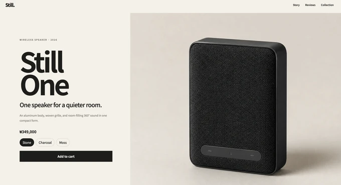
To see this pipeline in a real page, I built a wireless-speaker product page with Next.js App Router and deliberately added these performance problems:
- a roughly 13 MB main PNG image
- a 4.5 MB autoplay video downloaded before it enters the viewport
- a Google Fonts stylesheet loaded through CSS
@import - product information that appears only after JavaScript runs
- a data waterfall that fetches product data, reviews, and recommendations in sequence
- a layout that reserves no space for content that appears later
I also wrote Playwright tests that verify whether each problem has been addressed. The tests intentionally fail on the main branch and pass after the optimizations are complete.
The full exercise is available in the web-performance-lab repository.
Image optimization
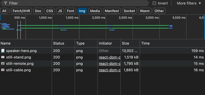
The first target is image optimization. The main image appears at a size that fits the viewport, but the browser still downloads the original 13 MB PNG. Product images near the bottom of the page are also much larger than their rendered size.
CSS width changes only the displayed size. It does not reduce the number of bytes the browser downloads. The main image is also the LCP element, so a late image directly delays LCP.
Images are often among the largest resources on a page. Image optimization starts with delivering an image close to its displayed dimensions and using an efficient format such as WebP or AVIF. Responsive pages can use srcset and sizes to offer multiple candidates.
Next.js’s Image component automates this work. It creates optimized URLs for multiple sizes, transforms the selected image to the requested width and format, supports lazy loading, and reserves image space. In this experiment, I replaced the regular <img> with Image and supplied the layout and loading information it needed.
<Image
  src="/speaker-hero.png"
  alt="Still One wireless speaker"
  width={2400}
  height={1800}
  sizes="(max-width: 800px) 100vw, 61vw"
  loading="eager"
/>
width and height describe the source image’s dimensions. The browser uses them to calculate its aspect ratio and reserve space before the file arrives, reducing the chance that surrounding content will move when the image appears.
sizes tells the browser how much space the image occupies at each viewport width. The browser combines this value with device pixel density to choose a candidate from srcset. Next.js does not directly decide whether the device is mobile or desktop. If sizes overstates the displayed width, the browser may download an unnecessarily large image.
When the selected variant is requested for the first time and is not cached, Next.js creates the required width and format and stores the result. On Vercel, optimized images are cached on the CDN. With the default optimizer in a self-hosted deployment, they are stored in the server’s disk cache. Because the first request may include transformation time, measurements should distinguish a cold cache from a warm one.
Loading priority also depends on position. The main LCP image uses loading="eager", so the browser requests it as soon as it discovers the element. Product images farther down the page use loading="lazy" and wait until they approach the viewport.
preload places the image URL in <head> so the browser can discover it earlier. I did not use it here because the main image was already discoverable in the initial HTML without a resource-discovery delay.
Applying eager or preload to too many images can keep the LCP image from getting enough bandwidth, so both should be reserved for genuinely important resources.
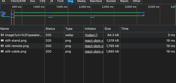
After optimization, the browser received a 64.3 kB WebP instead of the 13,002 kB PNG—a reduction of roughly 99.5%.
Video optimization

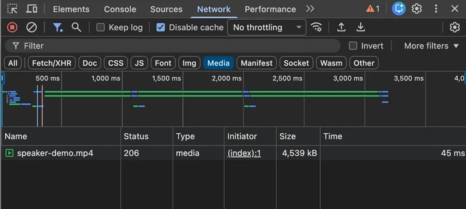
Next is the product video. It sits below the fold, but before optimization the browser starts downloading the 4.5 MB file as soon as the page opens.
Video optimization has two broad parts. The first is reducing the file itself by adjusting resolution, compression, and codecs. A CDN can help through caching, while a video-streaming service can adapt quality to network conditions. The web.dev video performance guide covers these techniques in more detail.
The other part is deciding when the request should begin. Even when an external server delivers a video efficiently, the browser’s request timing remains a separate concern. Downloading an offscreen video immediately can delay images and fonts needed for the initial view. If the user never reaches the video, those bytes are never used.
This experiment focuses on request timing. Before optimization, autoplay starts a video request for automatic playback, while preload="auto" allows the browser to fetch video data before playback begins. preload is only a hint, so the browser does not have to follow it exactly, and autoplay takes precedence when both are present.
At the time of writing, loading="lazy" on <video> is a relatively new experimental feature. Chrome supports it from version 150, but Firefox and Safari do not. Browsers without support may simply ignore the attribute.
Next.js does not provide a built-in component that optimizes video requests in the way Image optimizes images. Its video guide recommends choosing between the native <video> element and an external video service based on the use case. To get consistent behavior across browsers, this experiment uses a small custom Video component.
<Video
  src="/speaker-demo.mp4"
  poster="/speaker-demo-poster.jpg"
  width={1920}
  height={1080}
  loading="lazy"
  autoPlay
  loop
  muted
  playsInline
  preload="auto"
/>
The component handles its loading prop instead of passing it directly to the browser. It uses Intersection Observer to detect when the video enters the viewport and only then attaches src. Before that moment, the browser does not know the video URL, so neither autoplay nor preload="auto" can start a request. In this implementation, attaching src, not the preload value, determines request timing. Once src is attached, downloading and autoplay begin.
To meet autoplay policies, the video also uses muted and playsInline. Before the video loads, poster displays a representative still. The width, height, and CSS aspect-ratio reserve the video’s space in advance. This avoids an empty area while loading and reduces movement when the video appears. The poster itself should also be optimized for its displayed size.
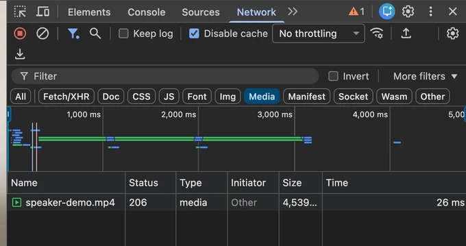
After the change, the video transferred during the initial view fell from 4,539 kB to 0 kB. The browser loaded a roughly 68 kB poster instead. Downloading and autoplay began when the user scrolled to the video. The video file itself did not become smaller; its unnecessary 4.5 MB initial request moved later.
Intersection Observer is not required for every video. A non-autoplay video can often use preload="none" and a play button instead. Deferring a video already in the initial viewport can make playback slower. This implementation also cannot load the video without JavaScript, so the right choice depends on the video’s position, playback behavior, and supported browsers.
Font optimization
Now consider how the browser discovers and requests fonts. The experiment page imports a Google Fonts stylesheet from its global CSS.
@import url("https://fonts.googleapis.com/css2?family=Noto+Sans+KR:wght@300;400;500;600;700;800;900&display=swap");When the browser finds the application stylesheet in HTML, it requests that file. CSS is needed to calculate how the page should look, so downloading and parsing it can delay the first render.
In this setup, the browser does not discover the Google Fonts stylesheet until the application CSS arrives. It cannot discover the font file URLs until the Google stylesheet arrives as well.
HTML
└─ application CSS
   └─ Google Fonts CSS
      └─ font files
The browser’s preload scanner looks ahead in the document separately from the main HTML parser. This lets it discover image and stylesheet URLs written in HTML and start their downloads early.
The scanner can only inspect HTML, however. It cannot see an @import or font URL inside CSS that has not been downloaded. The result is a request waterfall from application CSS to Google Fonts CSS and then to font files. A different origin such as Google Fonts may also require its own DNS lookup and connection.
When fonts are discovered late, users may first see a fallback font and then watch it change to the web font. Differences in character width can alter line breaks and element height, causing the page to move.
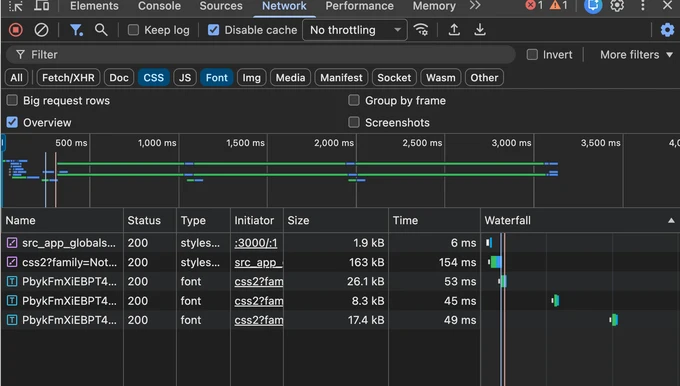
I replaced the import with next/font. At build time, next/font/google downloads the Google Fonts CSS and font files and includes them as application assets. The user’s browser no longer needs to contact Google when opening the page. In this experiment, serving the font from the same origin also removes the separate DNS lookup and connection for Google Fonts.
import { Noto_Sans_KR } from "next/font/google"

const notoSansKr = Noto_Sans_KR({
  display: "swap",
  subsets: ["latin"],
  weight: "variable",
})

export default function RootLayout({ children }) {
  return (
    <html lang="en">
      <body className={notoSansKr.className}>{children}</body>
    </html>
  )
}
Next.js uses this configuration to generate @font-face, create a class name, and connect the font files. Applying the class in the root layout makes the font available to every page below it.
It also places <link rel="preload"> for the configured subset in the initial HTML <head>. The browser can discover that URL directly in HTML and begin the font request without waiting for the application CSS.
subsets: ["latin"] means the Latin font subset is preloaded. It does not remove Korean characters. The browser compares the page text with each unicode-range in the generated CSS and requests additional Korean font files when they are needed.
weight: "variable" uses one variable font for a range of weights instead of configuring a separate font for each weight. The font can still be split into multiple files by character range.
display: "swap" keeps text visible in a fallback font while the web font loads. The change from fallback to web font may still be briefly visible.
next/font also adjusts the fallback font’s metrics to more closely match the web font, reducing the chance of large line-break or layout changes during the swap. Other elements can still move, so CLS needs to be checked on the actual page.
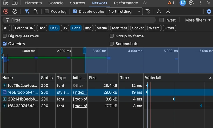
The Network recording shows that the 163 kB Google Fonts CSS request disappeared and the first font request began directly from the initial document. In the development server, the combined CSS and font response size fell from about 216.7 kB to 81.7 kB. Because this was measured in development, it should be verified again after deployment.
Three font requests remain after the change. That does not mean the font was left unoptimized. The browser selected the files needed for the page’s character ranges according to unicode-range. The important change is not the number of font files, but the removal of the extra request step through an external stylesheet.
Preloading too many fonts can delay other resources needed for the initial view. It is best to choose only the fonts, character subsets, and weights actually used above the fold, then confirm that the font swap does not move the page.
Rendering optimization
With resource requests in better shape, the next target is how product information is rendered. The original page is one large Client Component, and the browser fetches product data from useEffect. The initial HTML contains only a loading message, so users must wait for every step below before seeing the product name and price.
HTML
→ JavaScript
→ hydration
→ product API
→ product display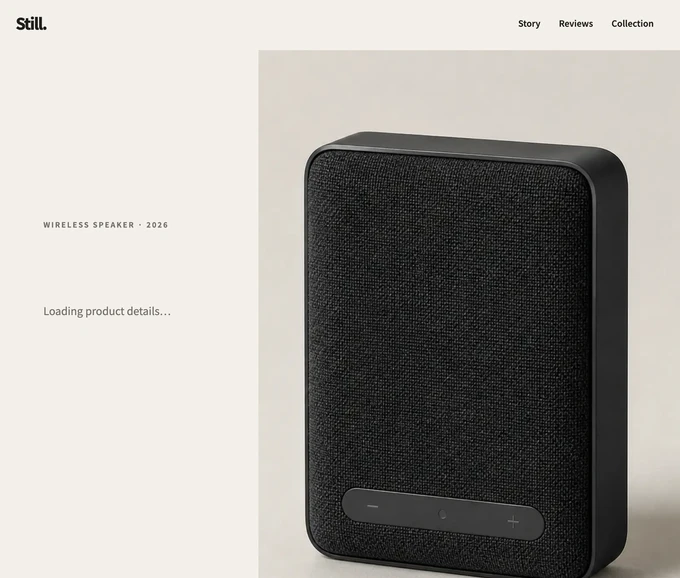
The Client Component itself is not the problem. On the initial page request, Next.js App Router also prerenders Client Components into HTML on the server. The problem is that product data is fetched in useEffect.
useEffect runs only after the browser downloads JavaScript and completes hydration. If JavaScript is disabled, the product request never begins and the page stays on the loading message.
Pages and layouts in Next.js App Router are Server Components by default. A Server Component can read data on the server. A component that needs state, events, or browser APIs becomes a Client Component by declaring "use client".
RSC and SSR
RSC (React Server Components) refers to Server Components and the system that processes them. A Server Component runs on the server, and its result is encoded in the RSC Payload. The component’s own code is not included in the browser’s JavaScript bundle.
The RSC Payload is not HTML. SSR (Server-Side Rendering) is the process that combines the RSC Payload and Client Components to produce HTML for the initial page request. The browser displays that HTML first, then hydration activates state and events in Client Components.
Following that distinction, I moved product data fetching into a Server Component and kept only interactive features such as color selection and the cart in Client Components.
Home                  Server Component
├─ ProductDetails     Server Component
│  └─ ProductPurchase Client Component
└─ ProductStory       Server Component
   └─ Video           Client Component
The rendering order now looks like this:
Request
→ fetch product on the server
→ HTML containing product information
→ enable purchasing interactions after hydration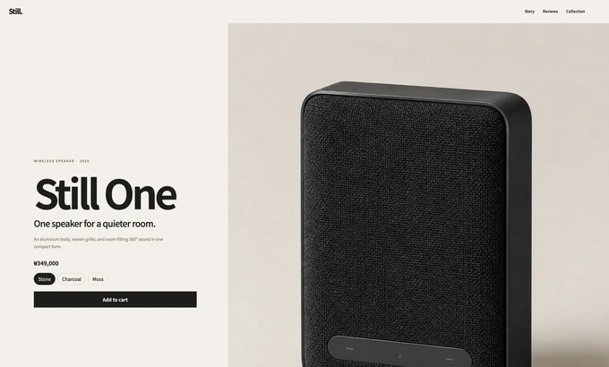
The 700 ms product query itself did not become faster. What changed was when it began. Before the change, the browser had to receive JavaScript and finish hydration before it could request the product. After the change, the query begins as soon as the page request reaches the server. JavaScript download and hydration are no longer prerequisites for showing the product.
In the experiment, the browser’s /api/product request disappeared and the product name and price were included in HTML. The information remains visible with JavaScript disabled, while only color selection and cart behavior depend on hydration. This also removed the layout shift caused when the loading message was replaced by the full hero content.
If the server is close to the data source or can access it directly, this approach can remove a browser-to-API round trip and keep credentials out of client code. If the data source is slow and the request cannot be cached, however, the server must wait longer and TTFB (Time to First Byte) can increase. The actual improvement in time to product content should therefore be measured in production.
Parallel data fetching
The rendering change split the original single-page component into smaller components with distinct responsibilities. Reviews and recommendations, however, were still fetched inside a ProductContent Client Component. Although neither request depended on the other, recommendations did not begin until reviews had finished.
const reviewResponse = await fetch("/api/reviews")
const reviews = await reviewResponse.json()

const recommendationResponse = await fetch("/api/recommendations")
const recommendations = await recommendationResponse.json()
The first await blocks the second request from starting. The 1,100 ms recommendation request follows the 900 ms review request, forming a data waterfall. Both requests also wait until product fetching and hydration finish.
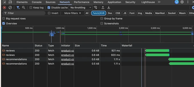
As a first step, I kept the existing structure and grouped the review and recommendation requests with Promise.all. Starting both requests together removed the wait between them, but they still began only after the product request and hydration. All content took about 2.1 seconds to appear, missing the test threshold of 1.8 seconds.
I then moved product data, reviews, and recommendations to the server and started all three requests with the page render. ProductContent was removed, while the Home Server Component directly rendered ProductReviews and RelatedProducts.
export default async function Home() {
  const [product, reviews, relatedProducts] = await Promise.all([
    getProduct(),
    getReviews(),
    getRelatedProducts(),
  ])

  return (
    <>
      <ProductDetails product={product} />
      <ProductReviews reviews={reviews} />
      <RelatedProducts products={relatedProducts} />
    </>
  )
}
Home starts all three requests together and passes each result to its component. The client-side useEffect calls are no longer needed. Total wait time is now close to the slowest request—1,100 ms—instead of the sum of 700 ms, 900 ms, and 1,100 ms. In the test, all content appeared within roughly 1.4 seconds and the test passed.
Promise.all still returns only after its slowest operation finishes. Product data may be ready at 700 ms, but the server cannot send the HTML until recommendations finish at 1,100 ms. One failed request also rejects the entire group. Parallel fetching should be used when the work is independent and the data source can handle the concurrent load.
Streaming SSR
Promise.all reduced the total wait, but the server still could not begin its response until every piece of content was ready. The product name and price did not need to wait for reviews and recommendations.
I changed the code so all three requests start together, but only product data is awaited at the page level.
const productPromise = getProduct()
const reviewsPromise = getReviews()
const relatedProductsPromise = getRelatedProducts()

const product = await productPromise
Reviews and recommendations each sit inside a React Suspense boundary. The server can send product information and fallback UI first, then continue the response with the remaining HTML as each request finishes.
<Suspense fallback={<ProductReviewsFallback />}>
  <ProductReviews reviewsPromise={reviewsPromise} />
</Suspense>

<Suspense fallback={<RelatedProductsFallback />}>
  <RelatedProducts productsPromise={relatedProductsPromise} />
</Suspense>
This uses React’s concurrent rendering. It does not mean that React runs work on several CPUs at once. It means React can pause a region whose data is not ready, work on another region, and resume the paused work later. A Suspense boundary tells React which region can wait without holding back the rest of the response.
0 ms      product, review, and recommendation requests begin
700 ms    product and fallback UI are sent
900 ms    reviews are sent
1100 ms   recommendations are sent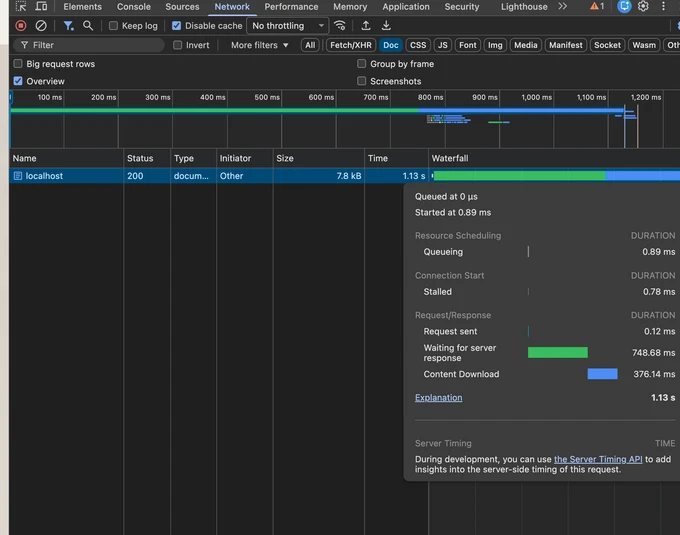
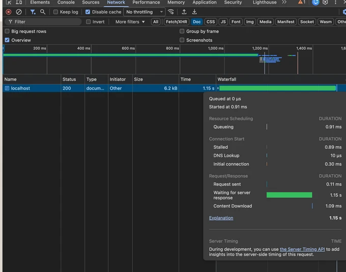
With Promise.all, the browser waited roughly 1.15 seconds for the server response to begin. After applying Streaming SSR, product information and fallback UI arrived in about 749 ms. The remaining HTML continued downloading over the next 376 ms.
The data fetching time and server workload did not decrease. What changed was the order in which the response was delivered. Users could see the important product information before all background work was complete.
Suspense boundaries
In this page, the product name and price needed for the initial view are awaited first. Reviews and recommendations have separate boundaries. Boundaries should reflect the order in which users need to see the content. Splitting them too finely can produce frequent, disconnected fallback transitions.
If a fallback and its real content have different heights, the content below can move and create CLS. For data that changes infrequently, caching or static rendering may be better than streaming because the server can send complete content from the beginning.
Layout stability
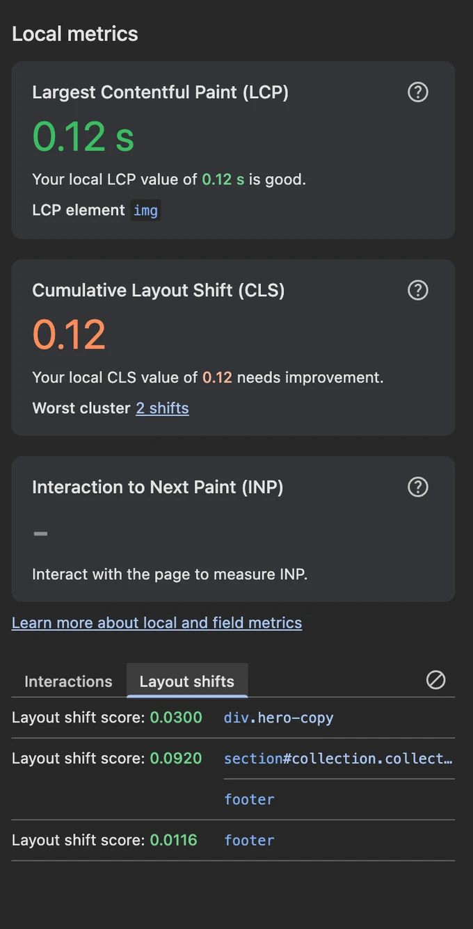
After the previous changes, I checked whether unexpected movement had also decreased. Running the original page in production mode produced a local CLS of 0.12 in Chrome DevTools. The Layout shifts list identified .hero-copy, the recommendations area, and the footer as elements that moved.
An element in this list is not necessarily the root cause. It may simply have been pushed by content inserted above it. On this page, product information replaced a loading message after useEffect, changing the height of .hero-copy. Three recommendation cards also replaced a short loading message and pushed the footer down.
Images and videos without known dimensions and web-font swaps are also common sources of layout shift. If the browser cannot reserve the required space, nearby elements can move when those resources arrive.
I did not add code solely for CLS. Earlier optimizations had already addressed its causes.
- Product information was included in the initial HTML, so the hero rendered at its complete height.
- Image
widthandheightand the video’saspect-ratioreserved space before the files arrived. - The review and recommendation fallbacks occupied roughly the same space as their final content.
next/fontreduced shifts caused by metric differences between the fallback and web fonts.
Under the same production conditions, the second measurement produced a CLS of 0, and the Layout shifts list was empty.
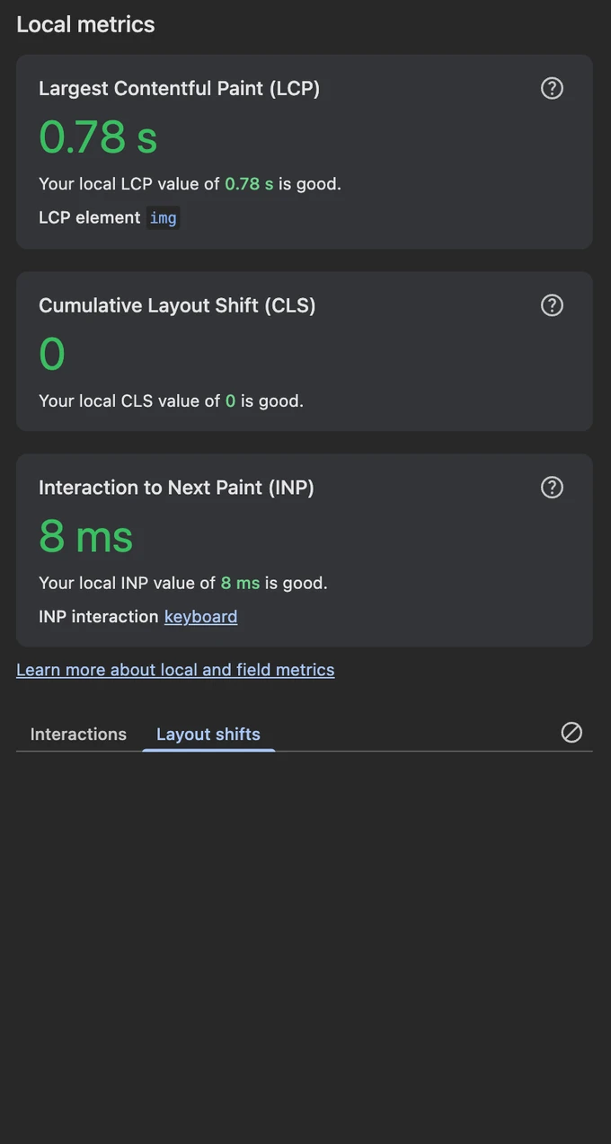
This means the shifts observed in this local test disappeared. A different viewport, content set, or interaction sequence can produce a different result.
Results
| Change | Observed result | User-facing effect |
|---|---|---|
| Images | 13,002 kB PNG → 64.3 kB WebP | Less data required for the main image |
| Video | Initial video transfer: 4,539 kB → 0 kB | Delays a video users may never watch and leaves more initial bandwidth for critical resources |
| Fonts | Removed the external Google Fonts CSS request | Earlier font discovery with less risk of delayed swaps and layout shifts |
| Rendering | Loading text without JavaScript → product name and price visible | Product information no longer waits for hydration |
| Data fetching | Sequential → concurrent; all content ready in about 1.4 seconds | Removes unnecessary waits between independent requests |
| Streaming SSR | Server response began at about 1.15 seconds → 749 ms | Important product content appears first even though total completion time is similar |
| Layout | Local CLS: 0.12 → 0 | Removes unexpected movement under the same test conditions |
Limitations
This exercise covers images, video, fonts, data fetching, and rendering on one product page. It does not cover every part of web performance. If the first content is slow, FCP (First Contentful Paint) may help. If the server response is slow, TTFB (Time to First Byte) is useful. When JavaScript blocks visual updates, TBT (Total Blocking Time) and long tasks deserve attention.
Features people use frequently, such as search and cart interactions, should also be measured for INP. The right metric and optimization depend on the page’s purpose and the user’s path through it.
Local measurements are useful for identifying causes and comparing changes, but they do not reproduce every CDN, cache, network, and server-location condition after deployment. A Preview deployment should be used to check cold and warm caches and streaming behavior. After launch, real-user data can show whether the improvements hold across a wider range of environments.
Closing thoughts
I used to begin with a Lighthouse score and use Next.js features such as Image and next/font without understanding their behavior in much depth. Building an intentionally slow page and comparing the before-and-after Network and Performance recordings made it much clearer how each feature changes browser requests and rendering.
Looking at both the research and the experiment also changed how I think about performance. It is not simply a matter of raising a score. Reducing waits and layout shifts helps people use a service more comfortably, and that difference can affect the business as well.
There is no single optimization that belongs on every page. The first step is to measure where users encounter friction, then choose an approach that matches the cause and its priority. That was the most important lesson from this exercise.
The measurements in this article come from an intentionally constructed local experiment. They do not guarantee the performance or business results of a real service. If you notice a factual error or a problem with the interpretation, please leave a comment.
References
- Ericsson, Ericsson Mobility Report, February 2016
- web.dev, Why does speed matter?
- web.dev, Vodafone: A 31% improvement in LCP increased sales by 8%
- web.dev, How redBus improved INP and increased sales by 7%
- web.dev, Web Vitals
- web.dev, Image performance
- web.dev, Video performance
- web.dev, Optimize web fonts
- web.dev, Don’t fight the browser preload scanner
- Next.js,
ImageComponent - Next.js, Videos
- Next.js, Font Optimization
- Next.js, Server and Client Components
- Next.js, Backend for Frontend
- Next.js, Fetching Data and Streaming
- React, React v18.0
- React, Suspense
- React, Specifying what goes into the shell